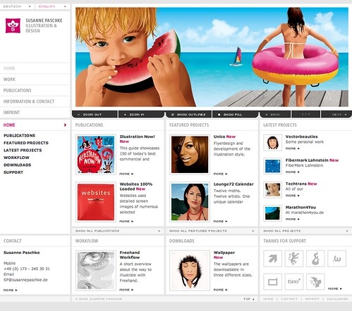
This is one of the headers that I liked. It is fun and is a clear representation of Summer.
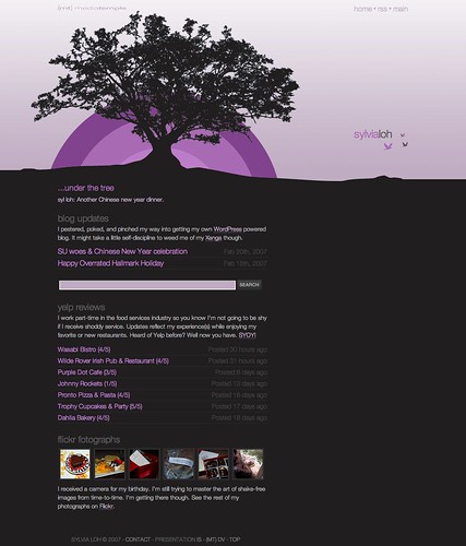
Here is a great monochromatic header that portrays a feeling of calm and relaxation. It makes me want to meditate.
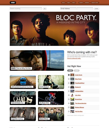
And finally, this one. I chose it because I love the band. Anyone know the name of their first album?
Cheers,
Ben
Sunday, April 25, 2010
New Header
I used the Adobe Garamound Pro font, in bold, with an inner bevel, highlight, and drop shadow for the main text, the just the plain Adobe Garamound Pro in bold for the subtext. I used a font that I found in the available list withing Fireworks. As I said, the filters I used were an inner bevel and a drop shadow. I did not use any blend modes because I liked the look as it was. The part that was tricky for me was figuring out what width I should use for the new header so that it would be wide enough but not too wide. I used 700 pixels and first, but that was too narrow, so I went to 750, but that was wide. At 725 it looks pretty good, but I may go back and shave it down to about 723 or 724 to make it ideal.
Sunday, April 11, 2010
Some blogs with varying color schemes.
First up is Serendipitous, with a mostly monochromatic color scheme.
Then we have East Coast Deserters, which uses an analogous color scheme.
Next up is South Africa 2010, a template which uses a complimentary color scheme of red and green that is also unsaturated.
I found a template called Highway, which uses a saturated pink car against a blue background.
The template called Breakfast uses unsaturated oranges in the header.
The color schemes of the blogs seem to have been chosen based on the mood and style of the creator, which leads to their blogs being not bad to look at, but also not particularly interesting or engaging. They are relying solely on content to draw the viewer in. The templates, however, were clearly created by people with some level of design experience. The color schemes used and the levels of saturation are all chosen to create a specific mood or convey some idea of what the content will be once you actually start reading the blog. It seems to follow that a simple but well designed blog will help draw reader into the site.
Can a leopard change it's spots?
Nope. But I can change the colors of my blog.
I chose this color scheme because it tied in with the template I had already chosen and because I love the combination of blue and orange. It is a split complementary color scheme based on a blue color. I did not use tints or shades because I wanted the colors to be bold but not overwhelming. This particular color scheme uses both warm and cool colors and I like that balance. Most of the background is tints and shades of blue, while the text and link colors are tints and shades of oranges and yellows. The colors I selected for each part of the blog are used to create contrast to make reading easier as well as to help the viewer more easily discern if they have already viewed a link on the page. Color is used to create repetition in the use of blues primarily for background colors and warmer oranges and yellows for text colors. This use of split complementary colors helps build a repeating pattern of warm colored text on a cool colored background, helping one balance out the other.
Enjoy!
Saturday, April 10, 2010
Self review of my blog.
I chose to use a right column layout with two columns. One column is twice as wide as the other. I liked that it put the content first as well as making navigation more instantly accessible to readers.
The header is based on a five unit grid, splitting it between a one unit section and a four unit section. The body of the page is on a three column grid in a right column layout.
For contrast I chose to use my favorite complimentary colors of orange and blue. From there I went with colors that would match the orange and blue feature without being difficult to read or too monochromatic. I also chose contrasting colors to make text more visible.
Besides using contrasting colors I also manipulated the size of different types of texts to set them apart. For example, titles of posts are both larger and a different color from the body of the post. Likewise, links will change from a highly visible color to a less visible color after being clicked on.
The amount of "white space" in this layout adds a sense of simplicity and sophistication that I like. It keeps the page from being cluttered and looking like a page full of ads in a phone book.
Because of the template I chose the proximity of different items is strongly delineated by blocks of different colors, but even within those blocks items that are related are grouped in tighter proximity, making the page easy to navigate both visually and electronically.
The repetition of colors, fonts, and shapes helps tie the whole page together so that it flows from top to bottom and side to side. This makes the page pleasant to take in so that the reader doesn't have to struggle to find whatever they are looking for and feel at ease while viewing the page.
One of my Fav's.
Post Secret is one of my favorite websites. I love the simplicity and harsh honesty that the page presents, as well as the raw emotion it delivers, and the beacon of hope that it has become for so many people.
For anyone who doesn't know it, Post Secret is a site dedicated to displaying homemade postcards that divulge a secret of the sender. The secrets range from silly to suicidal and as a result can often have a profound impact on both the sender and the reader. It has spread into an international phenomenon with the original founder having published multiple books and running a Post Secret blog in English, Spanish, French and German.
The site posts a fresh batch of secrets every week, so I usually check it on Mondays before I head to work. If anyone hasn't yet seen this site, please, go check it out. It's amazing.
Welcome to my blog dedicated to my bike racing adventures.
I started this blog last year in hopes that it would help me be consistent about writing race reports, but when my readership sucked, well, I didn't feel like I had anyone holding me accountable for those reports. Anyway, if you haven't guessed, I love bicycle racing. I also love training and coaching and hope to start my own business doing just that. That's sort of why I'm taking this class, in hopes that it will help me to be more independent in setting up a site for my business. So that's a tad about me and why I'm taking this course.
Subscribe to:
Posts (Atom)